Flutter: Using Keyboard Actions To Improve Mobile User Experience
This post covers three options for customizing an iOS or Android keyboard in a Flutter mobile application, with a code walkthrough of using the Keyboard Actions package to easily add keyboard features that increase user efficiency.
Mobile app developers, have you ever noticed that the native iOS numeric keyboard does not include certain features that might be helpful? For example, a Done button? Or how about arrow buttons to traverse form fields? To jog your memory, here’s what the native iOS numeric keyboard looks like:
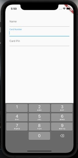
Talk about minimalist… numbers and a button to delete characters, that’s all you get.
How does the user get to the next field? Well, she has to interact with the form, of course, by manually selecting the next field. Wouldn’t it be better to allow your user to remain on the keyboard and be able to get to the next field?
Or, what if the last field on the screen is a numeric field… how does the user submit the form? Again, the user is forced to interact with the screen itself, most likely through the usage of a “Save” or “Submit” button.
Lastly, what if the user just wants to hide the keyboard for whatever reason? If the user clicks outside the keyboard, it won’t hide by default. You have to write extra code to support that, as well.
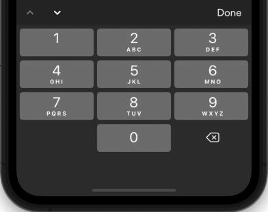
In reality, iOS users are probably used to interacting with form fields in that way so it’s not the end of the world. It’s just, there is a better way – and Android shows us that way. Take a look at the Android Numeric Keyboard:

In the first screenshot, notice the Next button to get to the next field. Also, note that the user can always use the hardware button to close the keyboard at any time. On the second screenshot, Android conveniently swaps out the Next button with a Done button (a checkmark).
Personally, I’d prefer textual buttons that say ‘Next’ and ‘Done’, but at least the options are there.
We can’t change the default elements of the iOS keyboard but there is a way we can handle all these problems. What we need is an Action Bar that sits over the keyboard that looks something like this:
Let’s look at a few ways you might accomplish this in a Flutter app. (Not familiar with Flutter? Don’t miss this related post.)
Option 1: Give up, use the standard keyboard
Falling back to the standard keyboard is actually not the worst option. Using the standard keyboard, your user will be able to type numbers into the field and you (the developer) can configure the bottom right button to be a ’Next’ button or a ‘Done’ button.
But that approach has several drawbacks—maybe the biggest being that now the user has access to the entire keyboard, including letters and characters. This can potentially make validation on ‘numeric’ fields more complex.
Option 2: Create the Action Bar yourself
You could homebrew an action bar that sits above the keyboard, which could offer a ‘Done’ button and even arrow keys to traverse fields.
Here is a blog post that leads you through the Done button implementation if you want to go that route. However, that path entails writing code to create an overlay, grabbing the height of the keyboard, triggering the display of the bar when the keyboard is opened, etc, etc.
If I can avoid adding code to maintain, I’ll do it, so I decided to only go this route as a last resort.
Luckily, I didn’t have to because someone had already done the work for me.
Option 3: Use someone else’s (open source) work
Enter the Keyboard Actions package. This is a third-party package that easily handles all the challenges mentioned above.
Here is a thread from the Flutter repo in which the Keyboard Actions package is recommended as a method to handle adding an Actions Bar.
Below is the code from my screen prior to adding the Keyboard Actions package to the project. Note that you do need to use a StatefulWidget to utilize the Keyboard Actions package.
import 'package:flutter/material.dart';

void main() {
 runApp(const MaterialApp(home: MyApp()));
}

class MyApp extends StatefulWidget {
 const MyApp({Key? key}) : super(key: key);

 @override
 _MyAppState createState() => _MyAppState();
}

class _MyAppState extends State<MyApp> {
 @override
 Widget build(BuildContext context) {
   return Scaffold(
     body: Padding(
       padding: const EdgeInsets.all(25),
       child: ListView(
         children: const [
           TextField(
             decoration: InputDecoration(labelText: "Name!"),
             textInputAction: TextInputAction.next,
             keyboardType: TextInputType.text,
           ),
           TextField(
             decoration: InputDecoration(labelText: "Card Number"),
             textInputAction: TextInputAction.next,
             keyboardType: TextInputType.number,
           ),
           TextField(
             decoration: InputDecoration(labelText: "Card Pin"),
             textInputAction: TextInputAction.done,
             keyboardType: TextInputType.number,
           ),
         ],
       ),
     ),
   );
 }
}
Flutter Implementation
First, we need to add the Keyboard Actions package to our project.
$ flutter pub add keyboard_actions
After installation, import the package by adding this to the top of your code.
import 'package:keyboard_actions/keyboard_actions.dart';
The next thing we’ll do is add some FocusNodes. What is a FocusNode? From the Flutter docs:
A FocusNode is an object that can be used by a stateful widget to obtain the keyboard focus and to handle keyboard events.
So let’s add some FocusNodes to the top of our state class, one for each field in our form.
class _MyAppState extends State<MyApp> {
 final _nameFocus = FocusNode();
 final _cardNumberFocus = FocusNode();
 final _cardPinFocus = FocusNode();
Now we have to wire our fields up to those FocusNodes. Couldn’t be easier… note the focusNode lines on each TextField below.
           TextField(
             decoration: const InputDecoration(labelText: "Name"),
             textInputAction: TextInputAction.next,
             keyboardType: TextInputType.text,
             focusNode: _nameFocus,
           ),
           TextField(
             decoration: const InputDecoration(labelText: "Card Number"),
             textInputAction: TextInputAction.next,
             keyboardType: TextInputType.number,
             focusNode: _cardNumberFocus,
           ),
           TextField(
             decoration: const InputDecoration(labelText: "Card Pin"),
             textInputAction: TextInputAction.done,
             keyboardType: TextInputType.number,
             focusNode: _cardPinFocus,
           ),
So far we haven’t actually done anything with the Keyboard Actions package. Let’s change that now.
First, we need to write a small block of code to configure Keyboard Actions, letting it know which FocusNodes it’s handling and what should be done for each field. Somewhere in your state class, add the following:
/// Creates the [KeyboardActionsConfig] to hook up the fields
 /// and their focus nodes to our [FormKeyboardActions].
 KeyboardActionsConfig _buildKeyboardActionsConfig(BuildContext context) {
   return KeyboardActionsConfig(
     keyboardActionsPlatform: KeyboardActionsPlatform.ALL,
     keyboardBarColor: Colors.grey,
     actions: [
       KeyboardActionsItem(
         focusNode: _nameFocus,
       ),
       KeyboardActionsItem(
         focusNode: _cardNumberFocus,
       ),
       KeyboardActionsItem(
         focusNode: _cardPinFocus,
       ),
     ],
   );
 }
One last thing to do: wrap your form elements with the KeyboardActions widget. So our build method will look like this now:
 Widget build(BuildContext context) {
   return Scaffold(
     body: Padding(
       padding: const EdgeInsets.all(25),
       child: KeyboardActions(
         config: _buildKeyboardActionsConfig(context),
         child: ListView(
           children: [
             TextField(
               decoration: const InputDecoration(labelText: "Name"),
               textInputAction: TextInputAction.next,
               keyboardType: TextInputType.text,
               focusNode: _nameFocus,
             ),
             TextField(
               decoration: const InputDecoration(labelText: "Card Number"),
               textInputAction: TextInputAction.next,
               keyboardType: TextInputType.number,
               focusNode: _cardNumberFocus,
             ),
             TextField(
               decoration: const InputDecoration(labelText: "Card Pin"),
               textInputAction: TextInputAction.done,
               keyboardType: TextInputType.number,
               focusNode: _cardPinFocus,
             ),
           ],
         ),
       ),
     ),
   );
 }
Note ‘KeyboardActions’ near the top, with the config key pointing to our _buildKeyboardActionsConfig.
Now when we run our app, we’ll see our Action Bar above the keyboard.

As would be expected, the arrow keys cycle through the fields and the Done button closes the keyboard.
For the final field on our form, we can easily wire up a callback to fire when the Done button is pressed by adding onTapAction to the configuration for the field. For example, let’s add some code to show a dialog when the Done button is pressed.
       KeyboardActionsItem(
         focusNode: _cardPinFocus,
         onTapAction: () {
           showDialog(
               context: context,
               builder: (ctx) => const AlertDialog(
                     title: Text('Screen saved'),
                     content: Text(
                         "Probably taking the user to next screen or something now...."),
                   ));
         },
       ),
The result:

There are a number of customizations you can make such as adding other buttons, changing the color of the bar, hiding the arrows, and adding more complex interactions with your fields.
Also, note the keyboardActionsPlatform key in the configuration. In my example above, that key is set to KeyboardActionsPlatform.ALL, so the actions bar will display above keyboards in iOS and Android. If you would rather turn it off for Android, just set that key to KeyboardActionsPlatform.IOS.
Conclusion
Although there are other options for adding an action bar, such as falling back to the standard keyboard or creating your own, we’ve found that there are several drawbacks to these solutions. The biggest drawback to sticking with the standard keyboard is that you gain access to the whole keyboard, (including letters and characters) increasing complexity for the user. If you go the route of implementing your own action bar, you are guaranteed to put in extra effort writing and adding code to maintain. This, of course, is the last resort.
Lucky for us, somebody has already taken the liberty of creating an option that easily tackles all these challenges. The Keyboard Actions Package is already equipped with the tools you need to create arrows to hide/remain on the Keyboard, implement next/done buttons, and utilize the numeric Keyboard – all of which help to create a more user-friendly environment.
It’s always important to offer as much convenience and efficiency as we can to our users and packages like KeyboardActions help us do that. Maybe consider using it in your next Flutter app!
More From Ryan LaRue
About Keyhole Software
Expert team of software developer consultants solving complex software challenges for U.S. clients.
Share This Post
Join The Thousands Of Devs Who Subscribe
Related Articles
Don't miss these related blog posts

Digital Transformation Statistics 2026: Market Size, Industry Adoption, ROI, and the Agentic AI Acceleration Angle

Human Expertise Meets Intelligent Technology: Dr. Stephen U. Harris on How Innovation is Transforming Patient Care

Using GitHub Copilot for Pull Request Reviews: Benefits, Best Practices, and Real-World Experience
More Posts
Good! This post is creative, you’ll find a lot of new idea, it gives me inspiration. I believe I will also inspired by you and feel about extra new ideas. thanks.