
Introducing the View Transition API: Your DOM’s New Best Friend!
Tired of clunky transitions and tangled web states? Meet the View Transition API, your secret weapon for silky-smooth DOM transformations. Say hello to elegant animations and goodbye to the confusion of overlapping states. Your web pages are about to get a serious upgrade!
Think about it, page transitions aren’t all about the looks. They’re like guides, leading users through your content. And they’re not just about appearances, these transitions can also increase the perceived speed of how responsive your site feels, especially during async running tasks.
But you might be wondering, “Don’t we already have tools like CSS transitions and animations?” True, we do, but managing changes from one state to another can be a bit like wrangling a four-year-old for bed.
Imagine a basic situation. You’re swapping out one element and putting another in its place. This process needs both elements to exist together within the DOM at the same time. This not only presents technical challenges but also brings up usability concerns, as both elements share space at the same time. It’s not that we haven’t successfully tackled similar tasks in the past, it’s just that managing this kind of situation can be quite a hassle.
Support for View Transitions
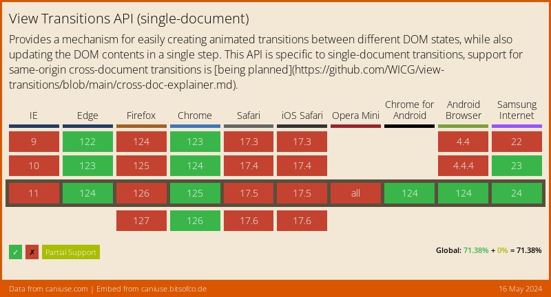
Current support is not widely adopted yet, as of the present moment, the support for the View Transition API is exclusively in Chrome version 111 and beyond.
The specification for the View Transition API is currently under development by the W3C CSS Working Group within the framework of the CSS View Transitions Module Level 1.
It’s important to note that the adoption of current support is still relatively limited. Therefore, any utilization of the new API should be approached with progressive enhancement in mind.
Exploring the Fundamentals of View Transitions
Let’s delve into the world of View Transitions by starting with a straightforward yet informative demo. Give it a try. Every time you click the page, an emoji will appear at random. Give it a shot and see what pops up!
Now, let’s examine things closely. You might have noticed a subtle cross-fade occurring between the departing emoji and the newly appearing one. This is actually the browser’s default behavior when it comes to View Transitions. It handles the transition between the old and new states seamlessly, employing a cross-fade effect.
See the Pen
View Transitions: Demo 1 Basic by Lawrence Chabela (@lawrencechabela)
on CodePen.
This effect is achieved by utilizing the startViewTransition API just before a DOM update takes place. Behind the scenes, invoking startViewTransition prompts the browser to capture a snapshot of the current DOM state. After this snapshot, the provided callback to the API is triggered, which then proceeds to update the DOM to its new state. Following this, the browser then takes an after snapshot of the DOM post update.
In the previous demo, we used a utility function to check for support for the View Transitions API. If support is detected, startViewTransition is called with the specified callback. If not, the callback is immediately invoked. This approach allows us to progressively enhance our usage of View Transitions when support is available.
function viewTransition(fn, params) {
    if (document.startViewTransition)
        document.startViewTransition(() => fn(params));
    else fn(params);
}

viewTransition(() => renderEmoji(getRandomEmoji()));
Once the browser has captured its “before” and “after” DOM snapshots, it proceeds to create a pseudo-DOM structure that looks like this:
::view-transition
└─ ::view-transition-group(root)
   └─ ::view-transition-image-pair(root)
      ├─ ::view-transition-old(root)
      └─ ::view-transition-new(root)
At the top layer, we have the ::view-transition, acting as an umbrella for all View Transitions. Below that, the ::view-transition-group(root) takes center stage, serving as the overarching container for our ::view-transition-old(root) or the previous DOM snapshot and the ::view-transition-new(root) for the current DOM snapshot.
Following this structural arrangement, the browser employs CSS animations to elegantly fade from ::view-transition-old(root) to ::view-transition-new(root). This default animation is defined in the User Agent’s style sheet.
html::view-transition-old() {
    animation-name: -ua-view-transition-fade-out;
    animation-duration: inherit;
    animation-fill-mode: inherit;
}
html::view-transition-new() {
    animation-name: -ua-view-transition-fade-in;
    animation-duration: inherit;
    animation-fill-mode: inherit;
}
What’s particularly impressive about this structure is its CSS accessibility. Since these are all able to be selected by CSS selectors, we can then add any valid CSS props to customize the animations and behavior. For instance, let’s extend the animation-duration to create a more prolonged fade.
See the Pen
View Transitions: Demo 2 Duration by Lawrence Chabela (@lawrencechabela)
on CodePen.
With the animation-duration set at 1500ms, the default cross-fade is now extended to give a bit more dramatic effect.
Mastering View Transitions: Unleashing the Hidden Dance of Elements
Before diving further into View Transitions API, we should speak about a user’s preference for prefers-reduced-motion. Users have the ability to enable preferences on their devices to minimize the amount of animation. We can read this preference by CSS or JS.
@media (prefers-reduced-motion) {
  /* styles to apply if a user's device settings are set to reduced motion */
}

window.matchMedia('(prefers-reduced-motion: reduce)');
By acknowledging and acting on this user preference, we can provide a more customized experience. This means we can create a digital environment that suits both those who enjoy animations and those who prefer a calmer interface.
Remember, at the heart of it, this is about offering an inclusive and enjoyable experience for all users. As we journey further into the realm of View Transitions, let’s keep in mind this simple yet impactful consideration.
Exploring View Transitions in Greater Depth
In our preceding demonstrations, we exclusively utilized the ::view-transition-group(root), which serves as the document body ::view-transition-group. However, it’s important to note that just as the root layer can possess a ::view-transition-group, so too can other elements. This grants us even finer control over the View Transitions.
Let’s now integrate this newfound understanding of View Transitions into our previous demo. Rather than a simple presentation of randomly selecting an emoji, let’s spice things up by introducing random positioning as well.
See the Pen
View Transitions: Demo 3 Groups by Lawrence Chabela (@lawrencechabela)
on CodePen.
Upon interacting with the demo, you’ll immediately notice a bit more flair. Our emoji subtly cross-fades while shifting its position. By designating our emoji element as a member of the “stage” view transition group, we unlock the ability to animate it independently of the root transition group.
.stage {
    ...
    view-transition-name: stage;
}
Given that the “stage” transition group is exclusively all that will be transitioning, there’s no need for the root transition group to capture its snapshots. To disable the transition group, we can simply apply.
:root {
    view-transition-name: none;
}
Keen observers might have already spotted a minor hiccup in our demo. During the transition to its new state, the browser generates the pseudo View Transition DOM. Positioned at the tip top of this hierarchy is the ::view-transition element, which inadvertently obstructs any click interactions throughout the view transition. We remedy this by setting its pointer-events</code. property to none.
::view-transition {
    pointer-events: none;
This granular control over specific transition groups further empowers us to distinctly target their previous and new states. This ability to pinpoint either of these states opens up avenues for applying distinct animations to each.
  ::view-transition-old(stage) {}
  ::view-transition-new(stage) {}
Continuing to add to the demo, we add a bit more spice. By adding to the ::view-transition-old(stage) and ::view-transition-new(stage) an associated exiting and entering CSS animation with corresponding animation-name, we now orchestrate cross-fades and scaling, contingent on whether it’s the old or new state.
See the Pen
View Transitions: Demo 4 Old and New Selectors by Lawrence Chabela (@lawrencechabela)
on CodePen.
An important caveat to bear in mind is the nature of the browser’s image-based snapshots of the pre and post states. Consequently, CSS designed for text properties or leveraging CSS custom properties won’t be directly applicable to these selectors.
Putting it All Together
Let’s harness our newfound knowledge of View Transitions to create something truly impressive!
See the Pen
View Transitions: Demo 5 Multiple Unique Groups by Lawrence Chabela (@lawrencechabela)
on CodePen.
Introducing our latest creation: a dynamic grid of random colors. Using the controls positioned at the top, you have the ability to toggle the visibility, alter the order, and combine the two. Furthermore, a simple click on any color triggers an effect – it expands, occupying additional rows and columns within the grid.
Taking a look under the hood, it’s worth highlighting a few key aspects of the demonstration.
First and foremost, as we delve into transitioning multiple elements, it becomes imperative that each element be given its own distinctive transition name. This ensures a dedicated transition layer for each, allowing for its own unique transition. Although the traditional approach would be to painfully craft each individual CSS selector using the nth-child attribute, there exists a more efficient alternative.
Consider the following snippet, where the pain point of coding numerous nth-child selectors is replaced by a dynamic CSS construction:
...
const groupName = `color-group-${index}`;
const transitionStyle = document.createElement("style");

color.setAttribute("class", "color");

// Embed a custom property, enabling CSS to access the index for color configuration.
color.style.setProperty("--index", index);

// Assign a distinct transition group name to each DOM element, enabling autonomous transitioning.
color.style.viewTransitionName = groupName;
...
In this, every color element is given a unique view transition name created from the current index. Subsequently, a style tag is generated, housing rules tailored to the corresponding view transition name:
transitionStyle.innerHTML = `
    @media (prefers-reduced-motion: no-preference) {
        ::view-transition-old(${groupName}):only-child {
            animation-name: scale-out;

            animation-duration: 200ms;
            animation-fill-mode: forwards;
            animation-timing-function: ease-out;
        }

        ::view-transition-new(${groupName}):only-child {
            animation-name: fade-in, scale-out;

            animation-duration: 100ms, 400ms;
            animation-direction: normal, reverse;
            animation-fill-mode: forwards, none;
            animation-timing-function: ease-in;
        }
    }

    ::view-transition-group(${groupName}) {
        animation-delay: ${index * 20}ms;
    }
`;
Taking advantage of the distinct transition group names, we create specific old and new transition group selectors, each with unique entry and exit animations. With the combination of a fading-in animation and a scaling-out counterpart, the entrance animation is constructed by reversing the scale-out animation. Moreover, to achieve the staggered animation sequence where one initiates as another concludes, each individual transition group is given a slight animation delay corresponding to its index.
Navigating the Web’s Choreography: Embracing the View Transition API
In the world of web development, where transitions can often be clunky and states tangled, the View Transition API emerges as a graceful solution, enabling seamless DOM transformations. Beyond visual appeal, these transitions serve as guides, leading users through digital content with finesse. While CSS animations offer a foundation, the View Transition API simplifies the intricate task of managing shifts between states.
This API’s finesse shines through as it manages the fluid transition between old and new DOM states, simplifying what could otherwise be a complex endeavor. Although currently confined to Chrome version 111 and onwards, its promise is reinforced by its development under the W3C CSS Working Group.
Whether your audience favors dynamic animations or a tranquil interface, the View Transition API empowers you to elevate your web pages with poise and elegance.
I would love to hear your thoughts in the comments below. Drop me a note, and don’t forget to subscribe to the Keyhole Dev Blog for more content.
More From Lawrence Chabela
About Keyhole Software
Expert team of software developer consultants solving complex software challenges for U.S. clients.
Share This Post
Join The Thousands Of Devs Who Subscribe


Must have information for all!