
Designing With Everyone in Mind: Color & Accessibility
February 2, 2026

Of all the design choices we make when building a web application, color is one of the most impactful. It sets the tone, defines the brand, and guides the user’s eye. That influence is exactly why color accessibility in web design matters—when color choices aren’t inclusive, they can unintentionally create barriers for users with visual impairments, including color blindness or color vision deficiency (CVD). It is estimated that 1 in 12 males (8%) and 1 in 200 females (0.5%) experience the most common form of color blindness, red-green. It’s important to take this into consideration to avoid leaving any users behind.
Designing with color accessibility isn’t about limiting your creativity; it’s about making smart, inclusive choices that result in a better product for everyone. By focusing on contrast, redundancy, and collaboration, we can build applications that are both beautiful and usable for all.
Use Contrast to Meet WCAG Color Accessibility Guidelines
The foundation of color accessibility in web design is simple: text and other important visual elements should be clearly distinguishable from their background. The key metric you need to know here is the contrast ratio. The Web Content Accessibility Guidelines (WCAG) 2.2 provide the industry-standard framework for it.
A contrast ratio measures the difference in perceived luminance (or brightness) between two colors. WCAG 2.2 sets minimum thresholds for this ratio:
- AA Level (Minimum Compliance):
- A contrast ratio of at least 4.5:1 for normal-sized text,
- and 3:1 for large text (18pt/24px or 14pt/18.5px bold).
- AAA Level (Enhanced Compliance):
- A contrast ratio of at least 7:1 for normal-sized text,
- and 4.5:1 for large text.
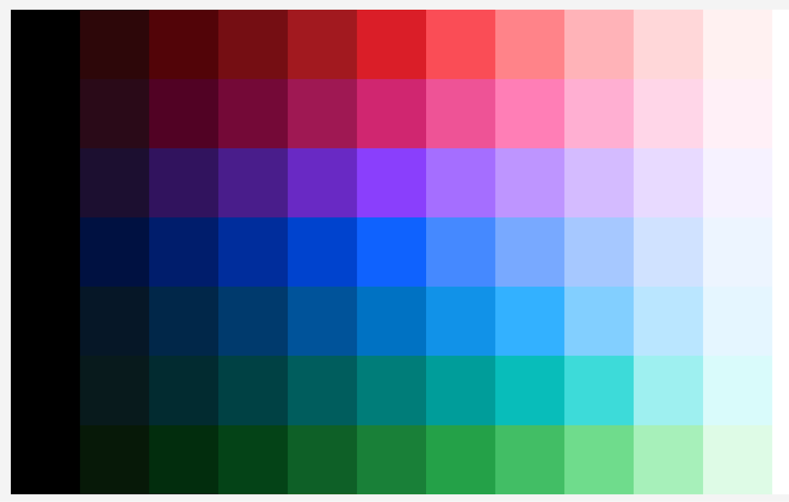
This might seem like an obvious guideline. Most people can intuit that something like black text on a white background is clearly distinguishable. The challenge comes when text and background colors aren’t so basic. After all, we’re not just building newspapers! A pop of color goes a long way toward giving users a more engaging, visually interesting experience.
That being said, it pays to confirm your contrast ratios instead of relying solely on your own vision. Don’t worry, you don’t need to calculate this by hand! Sites like WebAIM: Contrast Checker and browser developer tools (in Chrome, Firefox, and Edge) have features that let you check contrast ratios directly on the page. I’d suggest making a habit of checking these ratios as part of your development workflow. Hitting at least the AA standard should be pretty easy to achieve when creating a usable interface.
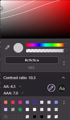
Screenshot from Chrome Development Tools
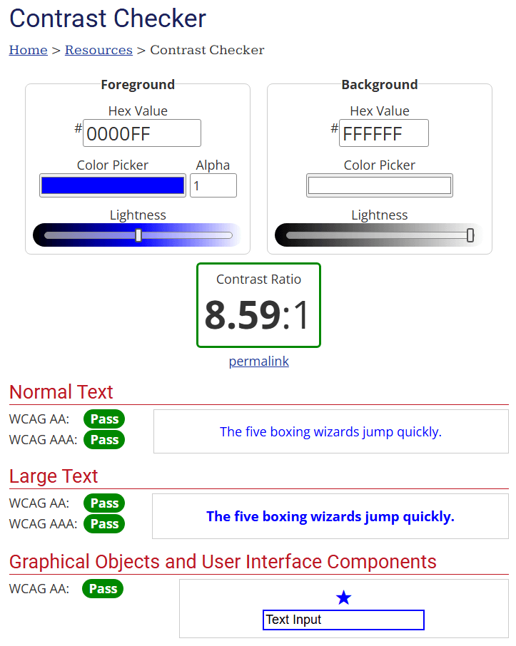
Screenshot from WebAIM: Contrast Checker
Don’t Rely on Color Alone to Convey Information
Relying solely on color to convey information is one of the most common accessibility pitfalls in color accessibility in web design. For the roughly 1 in 12 men and 1 in 200 women with some form of CVD, telling the difference between a red error message and a green success message might be impossible. One solution is to provide redundant clues.
This means using other visual indicators, in addition to color, to communicate meaning. Here are simple, real-world examples of accessibility beyond color that improve usability for all users.
- Form Validation: Instead of just a red border on an invalid input field, add a descriptive error message below the field and an alert icon (like an exclamation mark).
- Links: Don’t just colorize link text. The standard, time-tested convention is to also underline it. This makes links easy to identify without relying on color perception.
- Buttons: It’s common to use colors to help lead users through the flow of an app. Red for “delete,” green for “save,” etc. Adding an icon to a button can quickly and easily convey meaning to support the color of the background and even the text on the input.
By providing multiple ways to interpret information, you create a more robust and intuitive interface for everyone, not just those with CVD.
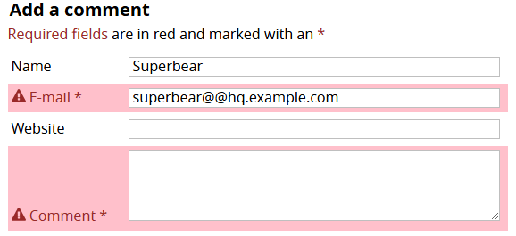
Example of color accessibility in form validation
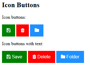
Using icons and text in addition to color on buttons to improve accessibility
Watch Your Tone: Adjust for Color Vision Deficiency
As much as you may try to plan for it, there will always be a time when you are backed into a corner and need to use a color combination that is among the most common color vision deficiency types. Like the red-green example given above, there are colors that present an intuitive meaning to many users but can become virtually indistinguishable for others. Where total avoidance of these colors is not practical, one technique to consider is to operate on the tone or temperature of the impacting colors.
Each color has many shades, some lighter and some darker, that can be considered as replacements to give a greater degree of contrast. Think about our red-green example. If using a warmer or darker red, try to match that with a cooler or lighter green. If possible, an even better replacement for red would be magenta. As a reference, take a look at the IBM Design Language specifications. By separating each basic color into a gradient of darker and lighter shades or hues, you have more options to pick from.
When in doubt, it may be helpful to test run your palette against color vision deficiency simulations. Tools like WhoCanUse, Coloring for Colorblindness, and Coblis Colorblind Simulator, among others, give you a look into how your colors may be perceived by users who experience CVD. These tools are not a full replacement for hands-on testers, but they can help you to hone your palette in the earlier stages of development.
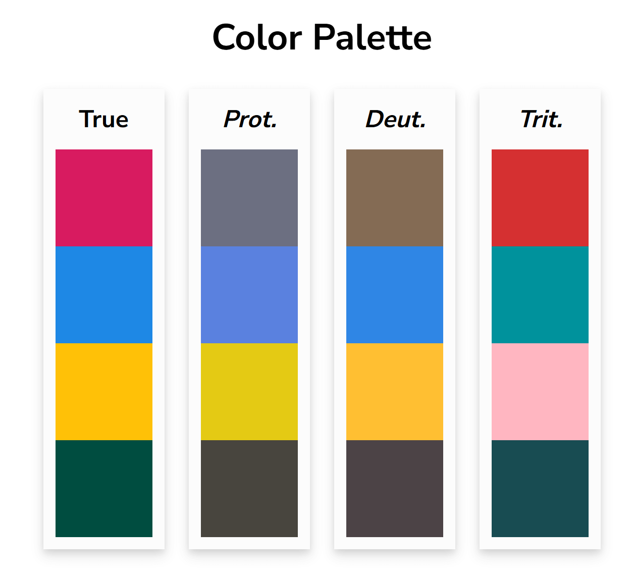
Screenshot from the Coloring for Colorblindness tool
Collaborate on Color
Often, a project’s color palette is heavily influenced by branding guidelines or stakeholder preferences. What happens when the primary brand color fails to meet contrast requirements against a white background? Instead of just saying “no,” you should engage stakeholders in a collaborative process. From my own personal experience, here are some tips for starting the conversation.
- Educate: Start by explaining the why. Show them the WCAG guidelines and explain the importance of creating an inclusive product that’s usable by the widest possible audience.
- Demonstrate: Use color blindness simulators to show them how users with different types of CVD would perceive their chosen color palette. Seeing the brand’s message become muddled or unreadable is a powerful motivator.
- Find Solutions Together: The goal isn’t to throw out the brand identity but to build an accessible palette around it. Work with them to find slightly darker or lighter shades of the brand colors that do meet contrast requirements. A brand’s “official blue” might be reserved for logos and non-essential decoration, while a new, accessible “web action blue” is created for all interactive elements like buttons and links.
By framing the conversation around creating a better, more effective product, you can turn stakeholders into accessibility advocates and arrive at a color palette that is both brand-aligned and accessible.
In Conclusion
Color accessibility in web design isn’t just about compliance. It’s about building clearer, more inclusive experiences that work for everyone, and building accessible applications is a hallmark of high-quality software. When it comes to color, the path to accessibility is clear: adhere to the contrast ratios defined in WCAG 2.2, provide redundant cues so that color isn’t the only method of communication, and work collaboratively with your team and stakeholders to create a palette that works for everyone.
These practices don’t just help a fraction of your users; they lead to clearer, more logical designs that improve the user experience across the board. Breaking down barriers to entry means that many more people are invited to find enjoyment in our hard work.
More From Forrest Goyer
About Keyhole Software
Expert team of software developer consultants solving complex software challenges for U.S. clients.
Share This Post
Related Posts
Join The Thousands Of Devs Who Subscribe

Discuss This Article
Subscribe
Login
0 Comments
Oldest