

Building a React Component Library for Next.js with Storybook
In my last post, Implementing GitHub OAuth with NextAuth.js, we set up a standard single sign on flow with GitHub OAuth in NextAuth.js. This article assumes that you have followed along with that article already, and have your own version of that project locally. If not, but you already have a Next.js project, then you can follow along here just the same.
Last time, we set up a very basic dashboard to demonstrate displaying a signed-in user’s name, avatar, and some usage data from the GitHub API. Since then, NextAuth.js has evolved into Auth.js, but the GitHub implementation remains largely the same. However, if you haven’t upgraded your Next.js projects in a while, I would recommend doing so first.
In this post, we’ll pick up where we left off: upgrading your project’s dependencies, then decomposing your components into a scalable library using atomic design principles (atoms, molecules, organisms, templates, and pages). From there, we’ll install and configure Storybook for Next.js and Tailwind, write your first component stories in Component Story Format 3, and set up shared fixtures so you can preview and test components without depending on live GitHub API calls.
Upgrading Dependencies
Before we start building a component library and setting up stories in Storybook, review the authentication setup from the previous article, and ensure you are running Node 22.19 or greater for Storybook 10 support. We are using NextAuth.js v4 for our GitHub integration, and this still works identically to how it did in the last post. However, NextAuth.js has been rebranded to Auth.js, with a new v5 which approaches configuration differently. If you want to upgrade to Auth.js v5, follow the migration guide here, but that is not required to follow along with the examples in this post. Finally, once you review the authentication setup, also confirm that you are using current versions of node and npm.
node -v   # inspect the version, update as needed for your OS
npm install next@latest react@latest react-dom@latest  # safe to keep up to date in dev projects
That’s it! If you have added any other packages to the project, you should audit those independently. My approach in development is to force updates to the latest version, “rip off the band aid”, and make sure packages are up to date on every iteration with npm audit fix --force. Note that this clears the advisory without any safety checks, meaning you may need to refactor parts of your code touching those libraries. If you are in production and need to move a bit more slowly, you can drop the --force flag and just run npm audit fix, then review the remaining issues manually.
Once you are finished, review the package.json file and the scripts available there. Make sure everything still builds and runs. Once verified, we can start looking at the UI components more carefully. We will use decomposition to create a structured component library for the Next.js project.
Creating a Component Library with Atomic Design
Atomic design is a methodology for breaking a UI into five reusable levels (atoms, molecules, organisms, templates, and pages) so components stay predictable and composable as a project grows.
Atomic design is a methodology for decomposing a UI into five reusable levels of components; atoms, molecules, organisms, templates, and pages. This allows components to stay portable, predictable, and composable as a project grows. For more information, check out Atomic Design by Brad Frost.
In the previous article, we placed components into a directory at src/app/components, but didn’t organize or decompose them into a proper library. Typically, in a small project with only a handful of components, the overhead of a component library and decomposition is not needed. However, as projects grow, it’s important for code to be scalable, iterable, and sharable. Using a component library accomplishes these goals. More importantly, anything under the app/route is a part of the Next.js App Router namespace, not an ideal place to store a library of components.
Create a new directory at src/lib, and move the components directory there. Then, create five folders within the components directory; atoms, molecules, organisms, templates, and pages. Each of these represents a level of abstraction and reusability of these components. Pages are composed of templates, which are composed of organisms, molecules, and individual atoms. Organisms themselves are more complex code blocks which contain many molecules, while molecules themselves are collections of atoms.
On Tailwind 4, the content array is gone entirely and content is detected automatically from the project root. However, in order for Tailwind 3 to work correctly at this path, we will need to add the lib path to the content array in tailwind.config.ts. This lets Tailwind know that it needs to parse strings here. If we were building a server-side library, or using a different css framework in our project, this step would be omitted or changed.
content: [
  './src/app/**/*.{js,ts,jsx,tsx,mdx}',
  './src/lib/**/*.{js,ts,jsx,tsx,mdx}',
]
Move the Header into Organisms. This is going to live outside of our common page structure and be included in the overall app layout. Note that we want to make sure we pass the session into the header, so that it has the data it needs to populate. If you prefer, you can extract the necessary data from the session, and pass the props into the session individually. For this example, we will skip this and just pass in the entire session.
layout.tsx

import type { Metadata } from "next";
import { Inter } from "next/font/google";
import "./globals.css";
import { Session } from "next-auth";
import { Header } from "@keyhole/lib/components/organisms/header";

const inter = Inter({ subsets: ["latin"] });

export const metadata: Metadata = {
  title: "Create Keyhole Next App",
  description: "Generated by create next app, customized by Keyhole Software",
};

export default function RootLayout({
  children,
}: Readonly<{
  children: React.ReactNode;
  session: Session | null;
}>) {
  return (
    <html lang="en">
      <body className={inter.className}>
        <Header session={session} />
        {children}
      </body>
    </html>
  );
}
This tells the server side renderer that no matter what page loads, we always want to include the Header in the layout.
"use client";
import { Session } from "next-auth";
import { SessionProvider, signIn, signOut, useSession } from "next-auth/react";
import { AvatarImage } from "@keyhole/lib/components/atoms/avatar-image";
import { NavLink } from "@keyhole/lib/components/molecules/nav-link";

const UserBar = () => {
  const { data: session, status } = useSession();

  return ( …extract markup here… );
};

export const Header = ({ session } : { session: Session | null}) => {

  return (
  <SessionProvider session={session}>
    <UserBar />
  </SessionProvider>
  );
}
Next, we want to extract our actual page content into the library, leaving each page.tsx in the src/app directory structure as a simple wrapper for a page component.
We’ll start by extracting the core component of the home page, the HeroSection, as an organism. To keep things simple, we are going to keep the path hardcoded, but we could also pass in the path of the Image here.
hero-section.tsx
import Image from 'next/image';

interface HeroSectionProps {
  name?: string;
}

export const HeroSection = ({ name }: HeroSectionProps) => (
  <>
    <Image src="/keyhole.svg" alt="Keyhole Logo" width={480} height={192} priority />
    <h1 className="p-2 text-3xl font-bold text-center">
      Welcome to Keyhole Next{name && `, ${name}`}!
    </h1>
    <p className="text-center mt-4">A Next.js example for developers.</p>
  </>
);
Then, we want to build out a shared template that the github and home pages can share.
page-template.tsx
import { ReactNode } from 'react';

export const PageTemplate = ({ children }: { children: ReactNode }) => (
  <main className="flex min-h-screen flex-col items-center justify-between p-24">
    <div className="z-10 w-full max-w-5xl items-center justify-between font-mono text-sm flex flex-col">
      {children}
    </div>
  </main>
);
This captures some shared basics from both pages and can be reused. However, if we need a different general layout, we can always create a new template. Next, let’s create the home page component. We simply want this page to consume our props and pass them into the HeroSection, nested within the PageTemplate.
home.tsx


import { PublicPageProps } from "@keyhole/lib/models/pageProps";
import { PageTemplate } from "@keyhole/lib/components/templates/page-template";
import { HeroSection } from "@keyhole/lib/components/organisms/hero-section";

export const Home = ({ name }: PublicPageProps) => (
  <PageTemplate>
    <HeroSection name={name} />
  </PageTemplate>
);
Now that we have a fully decomposed home page, let’s call it into the main landing page of our Next.js app.
page.tsx

import { getPublicPageProps  } from "@keyhole/controllers/PageController";
import { Home } from "@keyhole/lib/components/pages/home";
import { Metadata } from "next/types";

export const metadata: Metadata = {
  title: "Keyhole Next |  Home",
  description: "Welcome to Keyhole Next! A Next.js example for developers.",
};


export default async function HomePageView() {
  const props = await getPublicPageProps ();

  return <Home {...props} />;
}
Just like we extracted control logic into a controller last time, we are separating our user view concerns into a separate layer. Now, our pages simply define the route of a page, its metadata, the control logic which runs during pre-render on the server side, and the page we are sending directly to the web browser.
You can follow these same steps to decompose the GitHub page as well. If you do, you can extract reusable components for the avatar image, external links, section headings, nav links, the github event table, or the github profile we built in the last article.
Setting up Storybook
Storybook is an open source tool for building, previewing, and documenting UI components in isolation, outside of the actual application. Once your UI library is organized into an atomic structure, go ahead and install storybook at the project root.
npm create storybook@latest
Accept the prompts to install. Storybook should auto-detect Next.js and initialize @storybook/nextjs-vite as the framework. It will also generate some boilerplate stories in src/stories which you can review as examples before deleting. There will also be a .storybook at the project root which contains the configuration and entrypoint for Storybook. Storybook runs separately from the rest of the project by running storybook dev -p {port}, which starts the storybook UI at the specified port.
Since we are using Tailwind in this project, we have to make a couple changes to get styles to render correctly within Storybook. If you are using Tailwind 4, you may skip the content array in the example below. First, find .storybook/preview.ts and import ../src/app/globals.css. This will make sure the main stylesheet is pulled into Storybook. Then, find tailwind.config.ts and add this entry to the content array.
content: [
  './src/app/**/*.{js,ts,jsx,tsx,mdx}',
  './src/lib/**/*.{js,ts,jsx,tsx,mdx}',
  './src/stories/**/*.{js,ts,jsx,tsx,mdx}',
]
Storybook should be loading now, and the next step is to replace the boilerplate stories with functional stories which display the UI components from our project.
Writing Stories
Stories in storybook use the “Component Story Format”, currently on version 3.
import type { Meta, StoryObj } from '@storybook/nextjs-vite';
import { MyComponent } from '@keyhole/lib/components/atoms/my-component';

const meta = {
  title: 'Components/Atoms/MyComponent',  // controls sidebar hierarchy
  component: MyComponent,
  tags: ['autodocs'],                      // auto-generates docs page
} satisfies Meta<typeof MyComponent>;     // full TS inference on args

export default meta;
type Story = StoryObj<typeof meta>;

export const Default: Story = {
  args: { children: 'Hello' },
};
Here, the Meta wraps the component type and tells Storybook a bit about the story so it can be displayed correctly within the navigation and UI. The StoryObj accepts this Meta as a type, and returns a type we can use to instantiate the component within the story. Finally, Default is the name of the story, and accepts args in its constructor which will be passed along to the component, while also being editable within the Storybook UI.
Here is an example set of stories for the Home Page component we built above.
HomePage.stories.ts

import type { Meta, StoryObj } from '@storybook/nextjs-vite';
import { HomePage } from '@keyhole/lib/components/pages/home';

const meta = {
  title: 'Components/Pages/Home',
  component: Home,
  tags: ['autodocs'],
  parameters: {
    layout: 'fullscreen',
  },
} satisfies Meta<typeof HomeOage>;

export default meta;
type Story = StoryObj<typeof meta>;

export const Guest: Story = {
  args: {},
};

export const LoggedIn: Story = {
  args: {
    name: 'Jane Doe',
  },
};
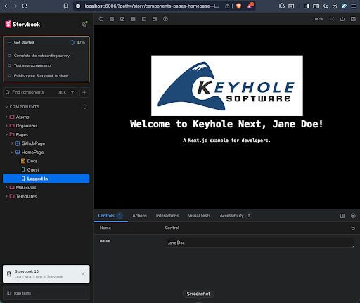
You can see that we have two stories here, “Guest” and “Logged In”. These represent the “initial state” of each story, and they are displayed next to one another in the Storybook navigation on the left. Under the “Logged in” story, you will notice under “Controls” on the bottom that there is a “name” field which matches the field we passed in through “args”. You can freely change this value to see what the component might look like with other names, allowing you to test component styles quickly with various name lengths.
As you can see, I have added stories for other components as well. Let’s take a look at NavLink.
NavLink.stories.ts

import type { Meta, StoryObj } from '@storybook/nextjs-vite';
import { NavLink } from '@keyhole/lib/components/molecules/nav-link';

const meta = {
  title: 'Components/Molecules/NavLink',
  component: NavLink,
  tags: ['autodocs'],
  parameters: {
    layout: 'centered',
  },
} satisfies Meta<typeof NavLink>;

export default meta;
type Story = StoryObj<typeof meta>;

export const Home: Story = {
  args: {
    href: '/',
    children: 'Home Page',
  },
};

export const GithubInfo: Story = {
  args: {
    href: '/github',
    children: 'Github Info',
  },
};
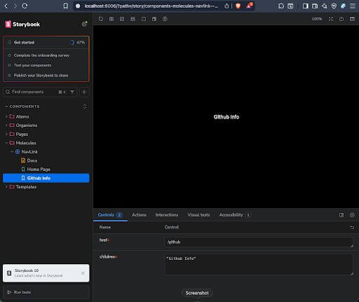
Since this component has multiple args, you can see both “href” and “children” in the controls. Note that “children” is a special prop representing the content within a component tag, it could be a string, a tag, or anything else which could live within the DOM nested within a NavLink component, which itself is just a simple anchor tag wrapping a paragraph with some padding.
nav-link.tsx

import { ReactNode } from 'react';

interface NavLinkProps {
  href: string;
  children: ReactNode;
}

export const NavLink = ({ href, children }: NavLinkProps) => (
  <a href={href}>
    <p className="p-3">{children}</p>
  </a>
);
Mocking Fixtures in Storybook
As you continue writing stories for other components, you should see them pop into the Storybook navigation as you work. If you find yourself with shared code or mocks, you can place those into a separate file to keep things lean. See the example for fixtures.ts below, which collects mocks needed for the GithubEventTable and GithubPage stories.
fixtures.ts

import { GithubEvent } from '@keyhole/lib/models/pageProps';

export const mockProfile = {
  id: 12345678,
  node_id: 'MDQ6VXNlcjEyMzQ1Njc4',
  avatar_url: 'https://avatars.githubusercontent.com/u/12345678',
  gravatar_id: '',
  url: 'https://api.github.com/users/janedoe',
  ….
};

export const mockEvents: GithubEvent[] = [
  {
    id: '1',
    type: 'PushEvent',
    repo: { name: 'janedoe/my-project' },
    payload: { commits: [{ message: 'Fix login bug' }, { message: 'Update README' }] },
    created_at: '2024-01-15T10:30:00Z',
  },
  {
    id: '2',
    type: 'PullRequestEvent',
    repo: { name: 'janedoe/my-project' },
    payload: { commits: [] },
    created_at: '2024-01-14T08:00:00Z',
  },
  {
    id: '3',
    type: 'PushEvent',
    repo: { name: 'janedoe/other-repo' },
    payload: { commits: [{ message: 'Initial commit' }] },
    created_at: '2024-01-13T15:45:00Z',
  },
];
Here, I have some mocked Github events and a mocked Github profile that matches the shape returned by GitHub’s API. Since we won’t be calling any external APIs in Storybook, these are useful for both stories and automated testing. I’ll be spreading the data from the mock into the story args here. If you end up with a lot of fixtures in your project, consider splitting them into several files under one directory instead.
GithubPage.stories.ts

…

const meta = {
  title: 'Components/Pages/GithubPage',
  component: GithubPage,
  tags: ['autodocs'],
  parameters: {
    layout: 'fullscreen',
  },
} satisfies Meta<typeof GithubPage>;

export default meta;
type Story = StoryObj<typeof meta>;

export const FullProfile: Story = {
  args: {
    profile: mockProfile,
    events: mockEvents,
  },
};

export const NoLocation: Story = {
  args: {
    profile: { ...mockProfile, location: null },
    events: mockEvents,
  },
};

export const NoEvents: Story = {
  args: {
    profile: mockProfile,
    events: [],
  },
};
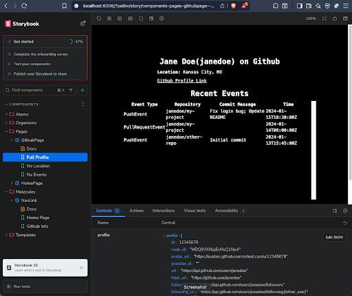
This mock data is important for making sure our component previews are useful and fully represent what the component will look like in the actual project.
Conclusion
In this post, we started with a Next.js app with a UI tangled into authentication, routing, and data fetching. We updated the dependencies of that project, extracted the client-side React components into an atomic library, and then built some stories in Storybook, allowing us to inject mock fixtures to visualize what our components might look like with real data.
Fixtures are important in all kinds of testing and helps you see your components in states which are difficult to reach through manual testing. With Storybook, you can capture the data state once, and review it anytime. Storybook also has a lot to offer in the individual controls, actions, interactions, and tests available through storybook, or the external testing libraries which can be used to unit test your visual components. For more information, see the official Storybook documentation.
More From Bob Palmer
About Keyhole Software
Expert team of software developer consultants solving complex software challenges for U.S. clients.
Share This Post
Join The Thousands Of Devs Who Subscribe


Discuss This Article
Subscribe
Login
0 Comments
Oldest