
A Look at Styled-Components
The React framework’s component-based approach makes managing large projects simpler. By making it easier to break functionality down into logical pieces that are encapsulated, the framework makes it easier for developers to manage. With that in mind, there have been a lot of choices when it comes to styling your React application. One approach is styled-components. This is a really intuitive option for styling. It makes it relatively easy to scope styles to the components that use them.
Let’s take a look at styled-components and why you should consider using them for your React application (if you haven’t already).
Installation
styled-components is a CSS-in-JS library. This just means you write your CSS in JavaScript. The client I am currently assisting transitioned to React about two years ago, and we have yet to write a single .css file for any of our React code.
Getting started is as easy as installing and importing the styled-components npm module.
import styled from 'styled-components';
Additionally, since you probably don’t want to start writing CSS in mono-colored strings, check out the styled-component’s documentation to see how to get syntax highlighting in your IDE of choice.
Creating a Styled-Component
styled-components use tagged template literals to create and store React components with your styles attached.
This is how you create a component:
const Heading = styled.h2`
  color: #8833BF;
  font-size: 2rem;
`;
As shown below, you can use these created components just like any other React component.
function App() {
  return (
    <Heading>Hello</Heading>
  );
}
In this case, since we set Heading to render h2, the HTML element type rendered to the DOM would be h2.
Making Changes
You can also change or adapt styled-components by passing them props, just like other components. To adapt the styles, simply interpolate a function that takes in props. Any strings returned from the function are added to your style template.
const Button = styled.button`
  color: ${props => props.primary ? 'blue': 'red' };
`

function App() {
  return (
    <Button primary>Button Text</Button>
  );
};
Being able to adapt styles based on props is probably one of the best arguments for using styled-components. It allows you to easily extend your styles to multiple uses in a way that feels very natural to React.
You can also use this feature to make style changes based on UI state. For example, instead of having to build logic into your component to apply a modifier class, you simply pass the state you want to adapt off of directly to the styled-component as a prop and make the changes there.
const Modal = styled.div`
  display: ${props => props.open ? 'flex' : 'none'};
`;

function App() {
  const [open, setOpen] = useState(false)
  return (
    <Modal open={open}>
	<Content />
    </Modal>
  );
};
If you need to make more complicated changes like adding multiple CSS properties, you can use the CSS helper to add in a block.
import styled, { css } from 'styled-components';

const Button = styled.button`
  color: red;

  ${props => props.primary && css`
	color: blue;
      border: 1px solid red;
      background-color: green;
      box-shadow: 1px 1px 1px #000;
  `}
`;
Similar to Less or Sass, it supports nested rules and the use of the & selector for self. You can also directly reference other styled-components – targeting a parent’s hover state for example.
const Parent = styled.div`
  display: flex;
`;

const Child = styled.div`
  ${Parent}:hover & {
    color: red;
  }
`;
How it Works
If you are unfamiliar, here is a bit more about how styled-companents work. Let’s start with tagged template literals, which is actually just an es6 feature built right into JavaScript.
If you run code like this:
const test = (...agrs) => {
  agrs.forEach(console.log);
};
test`How do ${() => 'tagged template literals'} work?`;
in your browser’s console, you’ll see it make 2 logs:
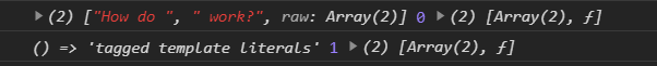
The first item is an array of two strings: [“How do “, “work?”].
The second item is the function we interpolated into the template literal. The array will be strings before and after the interpolations, and each parameter after the array will be the value of each interpolation. Styled-components under the covers is just checking if each interpolation is a function and invoking it with props from the component it is returning.
As for how it gets the styles to the page, it creates a stylesheet from all components currently being rendered and attaches it to the bottom of the head.
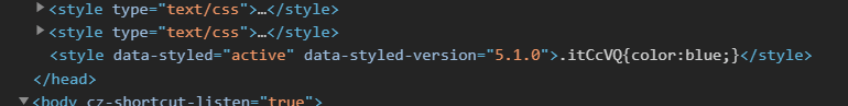
It automatically generates class names for each of the styles and applies the class names to the proper DOM elements. No need to worry about mapping CSS class names to your React components. Just import your styled-components, and use them like you would any other component. The generated class names mean you won’t have collisions or overlaps in class names to worry about.
Much like other CSS-in-JS solutions, because you’re just importing JavaScript, this makes it trivial to only include the needed styles in a bundle with proper code splitting. There is less concern for unused styles being bundled as well since you’re likely to just delete styled-components when you delete the component using them, or they won’t be imported any longer.
Conclusion
In the end, there are a lot of different methods for styling your React components, and truth be told, with enough effort, they all get the job done. However, the styled-components approach is intuitive, and it makes it easy to scope your styles to only the components that use them. If you’re developing a React application, I would highly recommend at least looking into using styled-components. I think you’ll like what you’ll find.
More From Nick Brown
About Keyhole Software
Expert team of software developer consultants solving complex software challenges for U.S. clients.
Share This Post
Join The Thousands Of Devs Who Subscribe


Discuss This Article
Subscribe
Login
0 Comments
Oldest