I’m sure you’ve come across the term “Business Intelligence” or “BI” in your workplace or on LinkedIn. It’s remarkable how many people are now embracing the advantages it offers for making better business decisions, making data more accessible and comprehensible, and much more.
However, what exactly is BI, and why should it matter to you in the first place?
What is Business Intelligence (BI)?
One of the primary objectives of BI is to enable companies to make informed, data-driven decisions by following a multi-step process. This process encompasses data collection through ETL (Extract, Transform, Load), data analysis, data visualization, and the subsequent presentation of findings to key decision-makers within the organization. These tasks are accomplished using BI tools and various programming languages, which are employed to access and analyze extensive datasets. The results are then presented in reports that incorporate charts, graphs, maps, and key performance indicators (KPIs) for a detailed overview of the business’s performance.
While there’s much more to delve into here, let’s begin by discussing the benefits of BI.
Why Should You Be Interested?
Consider this: every department within a company deals with data, and wherever there’s data, BI can step in to lend a hand. Dealing with data can be overwhelming, but fortunately, BI enables you to transform vast amounts of data into a more digestible and comprehensible format. When every department or team within a company utilizes automated reports to process and present this overwhelming data in an easily consumable way, you can make informed decisions more swiftly. This, in turn, translates into time saved, increased profitability for the company, and a more comprehensive understanding of your team’s and company’s performance. Having the key to a lock is only valuable if you know how to use it.
Another important benefit of adopting BI processes is the enhancement of your data quality. As part of the BI process, data is collected and analyzed, allowing for the identification of discrepancies and the improvement of data collection and storage procedures, ensuring your data is as accurate as possible. As I always emphasize, accurate data is the best data.
Now let’s dive into some examples of these reports.
BI Reporting Examples
Data Visualization serves as a fundamental pillar of Business Intelligence (BI), providing a visually engaging representation of the business or team’s performance. These reports are exceptionally user-friendly and offer a high degree of interactivity. When we mention interactivity, we’re not just talking about basic filters located at the top of the report, such as date range, location, sales representatives, or any other parameters you wish to apply. If you want to see more examples of the potential of data visualization, please visit this link.
To illustrate, when you interact with a bar chart by clicking on a specific bar, the entire array of visual elements within the report can dynamically adjust to reflect your selection. For example, if a chart highlights the regions with the highest sales, choosing a specific region will cause all other charts and graphs in the report to refocus on that selected region. The beauty of these reports lies in their versatility; they can be as complex or as straightforward as your needs dictate.
Tools like Power BI, Tableau, and the paginated reports listed below are linked directly to the data source, which means that when the underlying data is updated, the report seamlessly reflects these changes upon refreshing. You have the flexibility to refresh the report manually or set it to update on a schedule that suits your preferences, whether that’s daily, weekly, or any other frequency you desire. Once the report is meticulously crafted, it can be seamlessly published to its designated space, where you can grant access to authorized users for viewing.
Here are some examples of BI Reporting Tools.
Power BI
As Power BI is a Microsoft product, it has rapidly emerged as the de facto industry standard. This is primarily due to its seamless integration with other Microsoft software, fostering a sense of trust and familiarity among organizations already invested in Microsoft’s ecosystem.
In my perspective, PowerBI stands out as a relatively developer-friendly reporting tool, but as you dive deeper into customization, it can become increasingly complex. Once you know the basic layout of Power BI, building reports, implementing filters, incorporating visuals, and tracking KPIs becomes straightforward. Power BI and Tableau are very similar for the end product. With some slight minor differences, they both display the data relatively the same. Ultimately you can recreate Power BI reports to mirror a Tableau report. Power BI caters to a broad spectrum of users and teams seeking a robust solution for data visualization.
However, it’s essential to acknowledge some of Power BI’s drawbacks, such as a steep learning curve for advanced customization, frustrating limitations on certain customization options, and its exclusive online availability. In my next blog post, I will delve deeper into Power BI, providing a more comprehensive analysis. Stay tuned for more insights. If you want to dive into Power BI on your own, the Power BI Website and Power BI Overview are some great resources.
This example report is pretty standard as to what you will find in the BI space. KPIs to the left, and Donut Chart, Bar Chart, and Pie chart with a table at the bottom. Visually and functionally, Tableau can develop the same result, it is just a matter of preference. However, the paginated reports will not get the interaction you would in Power BI and Tableau.
Tableau
Tableau is the runner-up in popularity, but I believe it is losing ground to Power BI quickly because it is more expensive to use and is not a Microsoft product, however, Tableau is owned by Salesforce.
One noteworthy aspect I admire about Tableau is its flexibility in customizing reports, a feature that surpasses Power BI in this regard. However, this enhanced customizability comes at a cost, making Tableau somewhat less developer-friendly compared to Power BI. While Power BI may lack some degree of customization, Tableau largely compensates for this limitation, though a few constraints persist. Both Power BI and Tableau cater effectively to individuals and teams seeking data visualization solutions.
Nevertheless, it’s crucial to recognize the primary limitations and drawbacks of Tableau. These include its comparatively higher cost and a focus primarily on visualizations, which necessitates thorough data modeling and cleaning prior to data integration into Tableau. I plan to delve further into these disadvantages in one of my upcoming blog posts, so again, stay tuned for more insights on the Keyhole Development Blog.
This report is pretty standard for Tableau – you have multiple bar and column graphs with some line charts and filters to the right. You can even really customize some of the visuals here, as Tableau has made it their mission to make visualizations very customizable. (Check out some ‘Viz of the Day’ examples here, or click here to learn more about Tableau).
SSRS or Power BI Paginated Reports (PR)
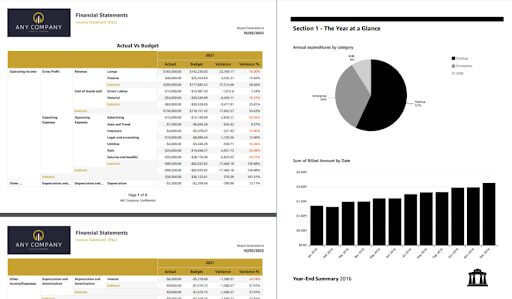
This reporting tool distinguishes itself from others, as it primarily caters to Paginated Reports, designed with a focus on print and email-friendly formats. SSRS and Power BI PR share remarkable similarities in their functionality and end results. It’s essential to note that Power BI PR is essentially Power BI’s equivalent to SSRS, so it’s crucial not to confuse Power BI PR with standard Power BI.
These Paginated reports, intended for printing or emailing, differ from interactive solutions like Power BI and Tableau. Nevertheless, you have the flexibility to configure these reports with filters, allowing for customization based on specific criteria, such as different regions within a company. This enables the creation and distribution of multiple tailored reports to meet diverse requirements.
These reports, unlike their interactive counterparts like Power BI or Tableau, lack customization and interactivity. This is a deliberate design choice, intended for printed use. In my perspective, Paginated Reports aren’t my personal preference; I prioritize the interactivity and flexibility offered by other report types. However, it’s worth noting that some companies highly value the print capability, and the choice between report types ultimately hinges on the goals and preferences of the teams or individuals involved. To learn more about SSRS and Paginated Reports, click here.
While there are more reporting tools out there, I find these to be the key players nowadays.
What Else?
While there is a wealth of information left to explore, that is a rabbit hole I will save for other blog posts. Before we end this discussion, there are a few final things I want to touch on.
SQL, short for Structured Query Language, plays a pivotal role in the world of Business Intelligence. It serves as the cornerstone for designing and managing data within database management systems. Proper data structuring is a prerequisite before it can be incorporated into reports, and SQL ensures this process is executed efficiently. SQL not only creates tables but also plays a crucial role in data analysis. While SQL can be used within Power BI, its traditional domain is within Database Management Systems such as Snowflake, Databricks, Azure, AWS, SSMS, Visual Studio, and more. Once you’ve set up your data environment in these systems, you can seamlessly connect it to your reporting tool. As I emphasized earlier, the accuracy of data is paramount for making informed decisions.
Until Next Time
We covered a lot today, and I appreciate you for following along on this journey. Business Intelligence (BI) is such a profound and indispensable practice within a company. I believe data is the key to a company’s success. If you don’t know how your company is performing, how will you be able to make well-informed decisions?
We delved into the parallels between Power BI and Tableau, two interactive reporting tools that empower businesses to gain profound insights from their data, facilitating well-informed decision-making. While both platforms can be configured to emulate each other’s reports to a considerable extent, it is important to note that Tableau offers greater customization options due to its specific focus. Both Power BI and Tableau are highly coveted by large corporations, as they seamlessly integrate with a wide array of data sources.
In contrast, Paginated Reports (including SSRS and Power BI Paginated Reports) are tailored to meet the needs of organizations seeking print-friendly or email-friendly reports. While this approach is preferred by some companies for various reasons, I personally advocate for interactive dashboards due to their capacity to convey a more comprehensive view of the data.
Once data has been collected, meticulously analyzed, and transformed, integrating it into a reporting tool emerges as the most effective means to showcase a company’s performance. This practice allows for the creation of customized reports for each department and facilitates automation to refresh data on a schedule that suits your specific requirements. The following examples underscore the substantial advantages of this approach:
- A cooperative organization could harness BI to monitor member acquisition and retention trends.
- BI tools have the capacity to automatically generate sales and delivery reports by extracting insights from CRM data.
- Sales teams can utilize BI to craft dashboards that provide a real-time view of each sales representative’s progress within the sales pipeline.
It is imperative to remember that your organization already possesses a wealth of data, and the ability to comprehend and harness this invaluable resource is well within your reach. Keyhole is committed to assisting you in this pivotal endeavor.
More From Caven Andersen
About Keyhole Software
Expert team of software developer consultants solving complex software challenges for U.S. clients.


