
Cook Your Own Modal with Styled Components
I created several JavaScript modal dialogs – I always extend a framework modal instead of scratch-coding my own. I thought I knew the things a framework needs to implement in order to present a modal, but did I? There was only one way to find out: cook my own JS browser modal, and that is exactly what we’ll do in this post.
In this blog, I’ll teach you how to code your own modal with Styled Components. You can find the entire project on GitHub here.
Big Picture
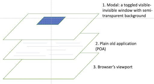
The first thing you’ll need to understand before you can code your own modal with Styled components is what a modal is. In the image above, we see a diagram of Modal DOM Layers. Its assumptions are:
- Modal HTML elements are always present in the DOM of the invoking client.
- A Modal with background covers the entire browser viewport (refer to number 3 in the above diagram).
- The Modal is invisible unless the modal is active (or “popped”).
- The background of the modal is semi-transparent when the modal is active, but it is invisible when the modal is dormant.
The element layers fill the viewport.
- A modal toggles between two modes: visible and invisible. We’ll discuss how to specify the mode next.
Show
When a client app wants to display and accept modal information it tells the modal to reveal itself – to appear. These are the steps:
- Accept a result function render prop.
- Change the setting of the modal background from
display: nonetodisplay: block. If you’re using flexbox, it could bedisplay: flex. - Transpose the actual modal dialog container to some position (e,g. dead-center) based on current underlying dimensions.
Close
When the user decides to close the modal, she clicks a button or other clickable control that the modal presented. A click handler in the modal must cause the following to close the modal:
- Set modal background to
display: none. - Send result (e.g. cancel or submitted object) to client via render prop.
Why Styled Components?
CSS settings do several things. They toggle the modal view open and closed, make the open modal’s background semi-transparent-visible, and block user interaction beneath the open modal background.
CSS Dynamics could be implemented via class-switching or by setting dynamic style attributes on the modal background DOM element that contain the modal dialog element. I chose a helper abstraction to flip CSS values.
I cooked up this modal in React. I’m a Styled Components fanboy, so I decided to use them to specify and manipulate the CSS. A Styled Component generates a React functional component that enables us to declaratively encapsulate a declarative object of CSS styles while also allowing us to dynamically alter a few of them.
I’ll admit it; using a library makes the dynamic styling job a lot easier, but I did not extend a black-box framework modal. I controlled my roll-your-own modal by using CSS through a component styling abstraction.
I used React JSX, so my modal component does not need scattered templates and CSS files. Instead, it lives in a cross-technology tree of JSX components that encapsulate one concern: render a dialog that accepts user input in a modal manner.
Demo Confirmation Modal
A light description of the basic modal units follows. These will loosely map to the diagram of Modal DOM Layers pictured in the first section, so I included it again for your convenience.
Modal Background
I defined a styled background component using a tagged ES6 template string. I’ll show you the code, and then I’ll walk you through some of the details.
Here’s the modal background component:
const Model = styled.div`
	z-index: auto;
	display: ${({show}) => (show ? 'block' : 'none')};
	position: fixed;
	top: 0;
	left: 0;
	height: 100vh;
	width:100vw;
	background: rgba(0,0,0,0.5);
`;
Look closely. There are backticks there that define an ES6 template. The styled.styled.div prefix is a template string tag. The Styled Component library uses that styled API function to create a React component based upon that div element that I chose for a component element base.
The div receives style from the CSS JS object that lies between those backticks. It populates an internally generated CSS class, which has a class attribute on the div or whatever tag element is specified.
Thus, Styled Components translate a tagged ES6 template to a functional React component that can accept props and raw DOM attributes.
I used props to provide just a few dynamic changes to CSS values. For example, see the setter function on the display item. It sets the value of the show React property.
The display toggle choice is a React show boolean prop that determines the modal’s visibility. It opens and closes the dialog according to its value of either block or none.
The background CSS value makes the entire modal background 50% opaque. However, this only takes effect when the modal is visible (ie “active”), meaning display: block is set.
Other CSS attributes peg the modal background to viewport (0,0) and flood the viewport background in a semi-transparent manner when visible. The modal background assemblage layer floats above other components. I include it last, so normally, it’s the top DOM dog.
Model Container
The container is a Styled Component that forms the modal panel or widget. It sits atop all else in the viewport. The modal background plus the modal pop-up widget form item 1 in the diagram above. Its dynamic CSS items are the top, left, and transform items.
I coded busy stanzas of “CM_xxx” that clutter the code somewhat. Sorry. They implement a choice of popup location that I needed for a different project, and out of convenience, I left them in for this project.
If the modal were always intended to open at, say, 50% inset and 50% downward, than a hardcoded CM_ENTER_CENTER would suffice for top, left, and transform that position the popup relative to the responsive parent.
const Container = styled.div`
	position:fixed;
	background: antiquewhite;
	width: 33%;
	height: auto;

	top: ${({openPos}) => (
	{
    	[CM_CENTER_CENTER]: '50%',
    	[CM_TOP_LEFT]: '10%',
    	[CM_TOP_CENTER]: '10%',
    	[CM_TOP_RIGHT]: '10%'
	}[openPos])};

	left: ${({openPos}) => (
	{
    	[CM_CENTER_CENTER]: '50%',
    	[CM_TOP_LEFT]: '5%',
    	[CM_TOP_CENTER]: '50%',
    	[CM_TOP_RIGHT]: '95%'
	}[openPos])};

	transform: ${({openPos}) => (
	{
    	[CM_CENTER_CENTER]: 'translate(-50%,-50%)',
    	[CM_TOP_LEFT]: 'translate(0,0)',
    	[CM_TOP_CENTER]: 'translate(-50%,0)',
    	[CM_TOP_RIGHT]: 'translate(-100%,0)'
	}[openPos])};

	border-radius: 10px;
	padding: 0.75rem;
	color: rgba(0,0,139, 0.7);
`;
Demo Popup
I needed a simple confirmation popup, so I showed it here to illustrate a working modal. It corresponds to the dark rectangle in item 1 of our diagram.
Before we get too deep, notice that it’s the app client code that closes the modal. The modal requests the close by calling the passed handleClose render prop in sendYes or sendNo. The passed information could be any object understood by both the modal and the client app.
export default function ConfirmationModalImpl(props) {
	const {
    	handleClose, // renderProp fn expects truthy or falsey
    	show,             // boolean - visible/invisible
    	headerText,   // text
    	detailText,     // html / inner text
    	openPos       // placement choice
	} = {...props};

	const sendYes = () => handleClose(true);

	const sendNo = () => handleClose(false);

	return (
    	<Model show={show}>
        	<Container openPos={openPos}>
            	<Header>{headerText}</Header>
            	<HBar/>
            	<Slot>{detailText}</Slot>
            	<ButtonBar>
                	<Button onClick={sendYes} primary={true}>Yes</Button>
                	<Button onClick={sendNo} primary={false}>No</Button>
            	</ButtonBar>
        	</Container>
    	</Model>
	);
}
Take note of the Slot sub-component. This Vue-like slot element could wrap any JSX expression. I’m thinking a “form” here could contribute to useful input dialog.
Client App
The following code corresponds to item 2 in the diagram.
<ConfirmationModal show={show} headerText="Confirm delete item?"
               	handleClose={hideModal} openPos={Pos.CM_TOP_CENTER}>
	{`Permanently delete "${itemName}"?`}
</ConfirmationModal>
The client application JSX includes a modal container (the actual dialog) and a modal background. I intend that its elements lie above the normal application z-index. I include the modal components late to give them altitude.
The client app supplies two props:
- The
showboolean prop toggles the modal visibility, which ultimately drivesdisplay: nonevsdisplay: block(or flex). - The
hideModalis a render callback prop that the modal calls to request that it be hidden, as well as to pass its result.
The client passes the following as hideModal prop reference.
const hideModal = (arg) => {
    	setShow(false);
    	actOnModalResult(arg);
};
It hides the modal while handling any data received from the model in the arg.
If your modal layer shows in a dev console DOM inspection but not on the screen, try upping its z-index value in the dev console to see if that makes it visible.
Run
The demo application is a thinly modified product of Create React App boilerplate (ugly, huh?). The sole interactive application control is a button that pops the modal by setting its show prop to true.
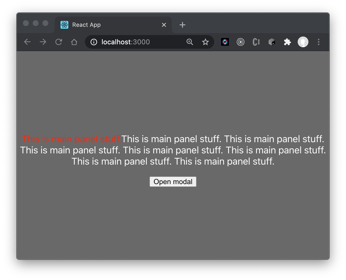
This dumbed-down demo offers to trigger a delete of “item one”. Ha! That’s a lie! This is a demo! In this demo-world, the caller pops a window.alert placeholder if I click “Yes.”
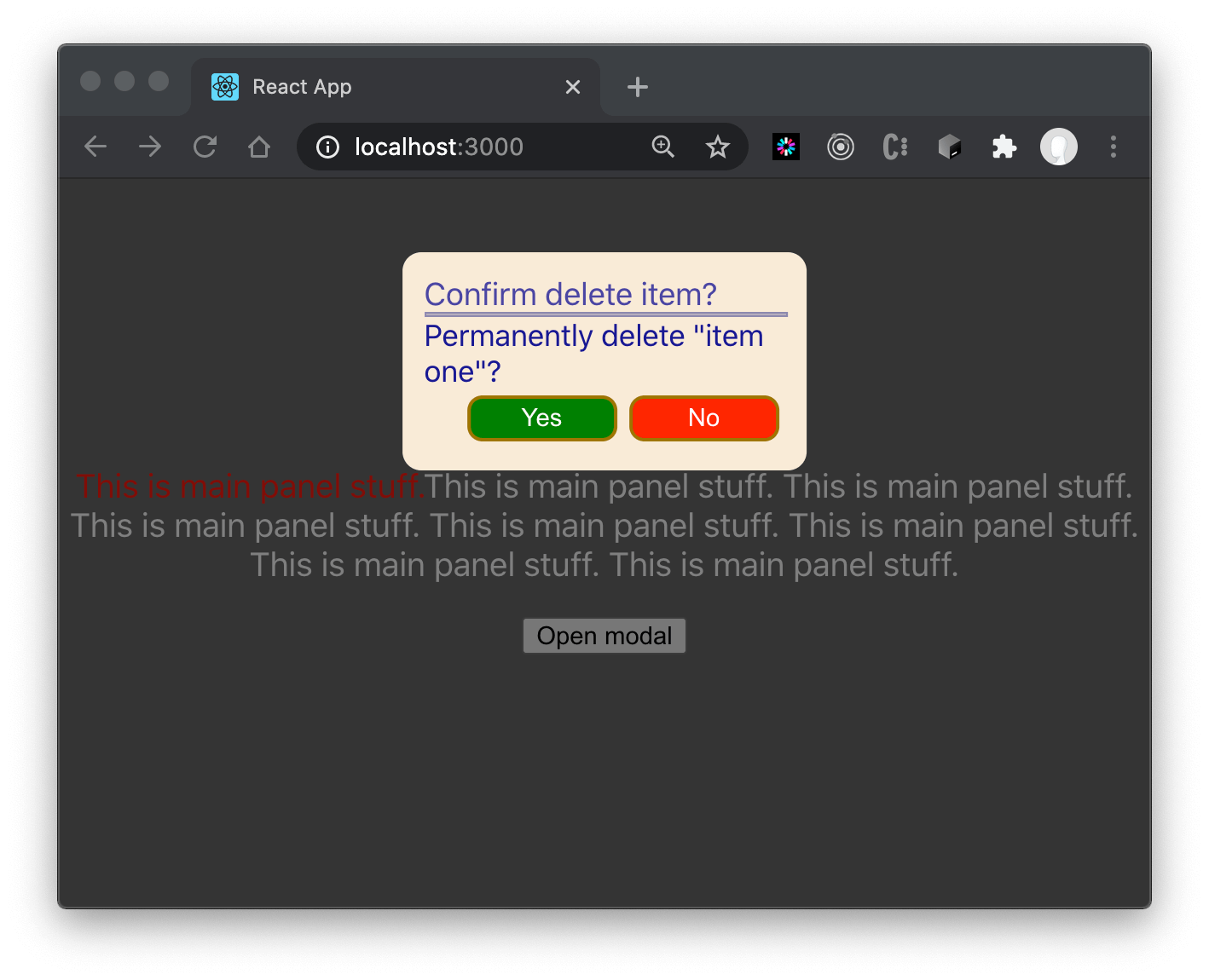
Notice that the application background is dim, but visible. That indicates that the items in the background are dormant while the modal shows. That’s part of the show “mode” of “modal”. If I click outside the popup, nothing happens. Instead, if desired, you could add code to catch the click to close the popup, returning a cancel or “no” result value.
How do we return a result? Clicking either “Yes” or “No” drives the demo modal widget to call the passed render prop function. It would programmatically request the caller to close the modal, passing a result.
Hack Into It
Let’s tweak CSS During Execution. It’s instructive to look at the CSS in the Chrome development console.
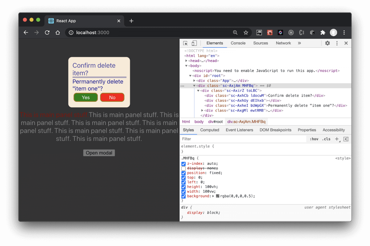
Above, I’ve highlighted the DOM parent that contains the modal layer. I turned off the display: none style item. The modal instantaneously became visible, and the background dimmed, becoming unresponsive to clicks on the dimmed open button. The simple underlying modal-open mechanism works.
Now, go try it! Try messing with the other CSS items so as to reinforce understanding of how a modal depends upon CSS items. Try it with models you find elsewhere, as well. Just get on and try it out to solidify what you’ve learned and to make you even more comfortable with doing it on your own.
Conclusion
That’s my approach to cooking a raw modal in React! It took minimal additional effort, as opposed to extending a framework modal, and it seriously enhanced my appreciation of CSS3 styling.
If I’d extended a framework-based modal, my client app would need to include it in its render tree anyway. The client would still need to execute a framework modal by setting an item that corresponds to the show prop. Finally, the client would supply a similar variant of the result callback, as well.
Most of my extra coding lies in a bit of coordination CSS between the modal background and the modal container. It seems straightforward to replicate in future projects.
I used styled components because I find them more expressive and encapsulation-friendly. No need to maintain synced component CSS lying elsewhere in the project. My modal component needs no scattered template and CSS files.
Thus, Styled Components greased the skids. I’m not ordinarily a fan of RYO (roll your own), but this added code was easy and repeatable for real projects. Perhaps an extra benefit is that I can change details that a framework modal might hide.
What about themes? If I’d needed an app-global theme, I could impose a theme via an API provided by Styled Components. The API can even adapt to an existing theme or choice of themes. Perhaps a user could dynamically switch between “Light” vs “Dark” (all the rage now). This could all be discussed more in depth in another blog down the road drilling into Styled Components.
If I were to create a complex modal form, I could adapt the approach from this blog by folding in React JSONSchema Forms. The component would wrap the form. This too could be the subject of a whole separate blog post.
I’ll retain this demo on GitHub as a pattern for spinning up pop-up dialogs or confirmations for future projects. To-date I have used it in personal projects and on one enterprise application.
Give it a try, see if you can code and please let me know what you think in the comments below.
More From Lou Mauget
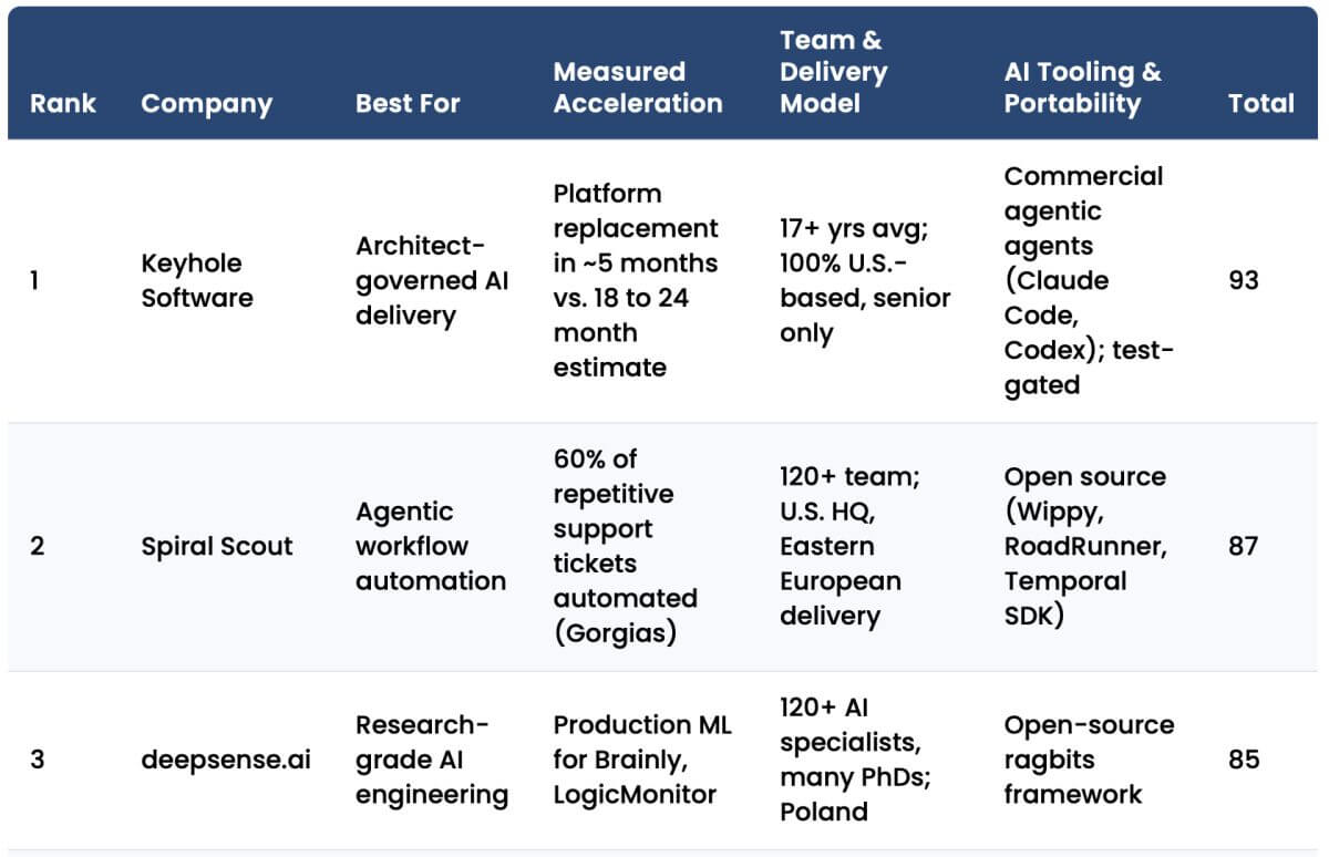
About Keyhole Software
Expert team of software developer consultants solving complex software challenges for U.S. clients.
Share This Post
Join The Thousands Of Devs Who Subscribe

Discuss This Article
Subscribe
Login
0 Comments
Oldest